Taking Notice of Anime – Good and Bad

If you’ve browsed through my links list, a few of them might seem out of place (and maybe a few are). One such link is “anime news“. I’ve referred to it only once before because, while interesting, I still consider anime’s impact on industrial design to be rather low-level. However, as manufacturing and design increasingly head to Asian suppliers in the same countries where Japanese animation has been off-shored, anime’s influence on product design could grow significantly; and I mean in the sense beyond the obvious Japanimation spin-off toys (eg Pokemon, Dragonball Z, Sailor Moon, etc). One example of how this kind of influence can be transferred is this computer mouse design created by Masamune Shiro, creator of the hugely popular Ghost in the Shell. As technology liberates designers from the tyranny of manufacturing constraints, this kind of crossover can only increase; more and more artists can move beyond images into tangible, manufacturable items.

That said, this brings me to today’s BusinessWeek online article “The Anime Biz“. From the article:

What’s more, the images that roll out of Japan’s studios inspire everything from Hollywood blockbusters to high fashion. Anime “has been hugely influential,” says John Lasseter, executive vice-president and creative chief at Pixar Animation Studios… He and other foreign media execs think the role of anime could expand much, much more. “It has the potential to be Japan’s next big export,” says Todd Miller, managing director for Asia at Sony Pictures Television.

Okay, so that was rather expected and reinforces some of my reasons for keeping an eye on that industry. But what was really interesting to me as a designer are the problems and difficulties the anime industry appears to be having. Some of the issues the article raises bring to mind recent conversations I’ve had with other industrial designers – discussions revolving around designers being allowed to move into the ranks of upper corporate management. I’ve always been hesitant on that issue and some of what this article points out is why I feel that way. This part is worth noting I think:

Just as problematic is a widespread lack of business savvy. While toymakers and TV broadcasters have made billions from marketing anime characters, most studios are run by artists who rose through the ranks of animators but have little experience in management.

It’s hard to argue with observations like those made in the article (some of the deals mentioned remind me of designers willing to work with no expectation of compensation – of any form – beyond gaining experience).

Sometimes I read things expecting one kind of story, and I get something more. This is one such article. If you’re in a creative profession I think you’ll also find it worth reading.


Lousy Headline, Good Body

I happened across this nice article over on Fast Company. The title royally sucks imo, but the piece is very well written. Thank you, Danielle Sacks.

I have my own theory as to why they used that deceptive headline. First read both my earlier post on Fast Company’s trendy “Design” articles AND the previously unavailable stories I mentioned which are now viewable (just follow the link in that post to find them). Should mention that I think this worthwhile article was also one of the “restricted content” articles and it could easily have been called out in that earlier post of mine based only on its title (lucky for me that I didn’t). Consequently maybe you’ll come to the same conclusion I did about this: bait and switch. Might work.

Mercedes DCX

Biomimetics isn’t really a topic I cover here, however two other areas seem to be increasingly tied to it. The first is the RepRap project. That makes sense to me since creating objects free from manufacturing constraints allows forms and solutions more like those in nature. Hard to beat Mother Nature. I’ve always been fascinated with the internal structure of bird bones for example – they’re strong and beautiful at the same time.

The other area is industrial design. As the 3D tools used within the profession become both more powerful and increasingly user-friendly, it’s only natural that forms will become more expressive and draw from a larger pool of inspiration. Mother Nature has a big pool and is pretty inspiring.

That said, I came across a short Yahoo photo blurb earlier this evening about Mercedes’ new concept vehicle – the DCX. Okay. Pretty funky. But not enough information for me to get really interested and bookmark the link. So leave it to WorldChanging to put some meat on the story’s bones in their write up. First, they have a more informative story on the vehicle. Second, they discuss the development of the vehicle (gotta love that). And third, they have some great links, including one to the Mercedes presskit. Awesome. And from that kit I grabbed the following images:

Mr. Boxfish

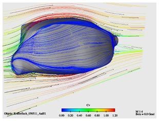
DCX virtual windtunnel

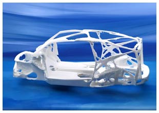
DCX structure

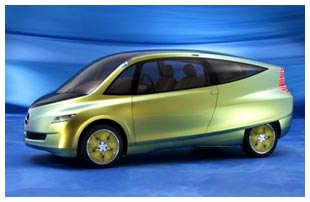
The Mercedes DCX

The top image I have to post. Even a fish deserves his/her 15 minutes of fame and being the inspiration for this vehicle qualifies in my book (we could use more fish in place of some characters in the news lately, imo). The second image is near and dear to my aerospace engineering heart. The third image got my attention because it both reminds me of those bird bones I mentioned above, and because it looks like an RP model. And the fourth image needs no explanation.

Now go read the article over on WorldChanging. But take that comment regarding the shape/coefficient with a grain of salt… a big reason for high drag coefficients are the seemingly minor things: non-flush surfaces, antennas, side mirrors, aso. I don’t see alot of that on this concept. All other things being equal, a flattened wedge does have a better coefficent (profile drag is the largest component of the overall equation). However, if you go sticking a bunch of aerials on that wedge and have mismatched surfaces all over and…. well, you get the point.

Computex and Case Mods

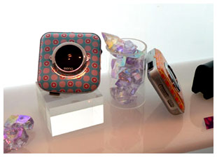
BenQ MP3 Player

I’ve not seen much news on the Computex show, so I’ve not seen many pictures. However, ExtremeTech has a nice little slideshow from the event which is worth a peek. There’s a mix of case designs, internal components, accessories, and of course “booth babes”. The above image of BenQ’s new mp3 player was the most interesting to me as it does seem to show that BenQ is at least trying to create their own look (when they’re not busy being heavily influenced by companies like Apple).

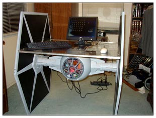
The unusual case shapes in that slideshow (am I the only one who thought some looked like plastic cosmetic cases you see at the dollar store?) reminded me of ExtremeTech’s 2005 Case Mod Competition (details here). The first weekly winner has been posted and is this hybrid desk-pc:

Tie Fighter Desk-PC

Okay. A little too niche for the mass market perhaps, but better than some of the stuff in that Computex slideshow. Obviously someone knows how to use shop tools. If only they knew how to use a camera to compose a nice photograph…

Android 8 In The Flesh

I’m surprised this hasn’t been covered by any of the design sites I visit, but niche toy site, Android8.com, in partnership with Josh Spear’s blogsite, has announced the winner of their toy design competition – Derek Duncan. And here is the winning design:

Android 8 Toy

Personally, I really like it and look forward to seeing how this translates into a manufactured piece. In the meantime, check out some more pics and a couple other entries here.