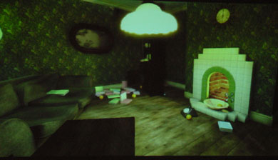
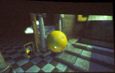
GameSpy has a less than stellar rep within the gaming community, but they do occasionally have articles I really enjoy. Such is the case with this article covering Peter Molyneux’s talk during the GDC’s new “Vision Track” lecture series. His discussion on Simplicity resonated with the designer in me, and there are a few interface designers out there who could learn a few things from him. But for shear fun, it’s the last portion of the article that gets the juices going. It’s Molyneaux’s “The Room” experiment that really begins to capture some of what I think will crack open cyberspace to the average person (or drive them crazy).

For years I’ve been puzzled by the hiring of architects to design virtual worlds, when I’ve always thought it should be just the opposite: virtual designers should be people who know nothing about real world constraints – children for example. “The Room” may seem unresolved to us adults; a virtual place with little or no purpose beyond defying the real world’s laws of…well… reality. But then we don’t turn cardboard boxes into juggernaut tanks to do battle on uncut lawns. Or sit for hours watching ants disappear into their little holes in the ground, imagining what it must be like to step into their labyrinthian world. Well, not anymore. I’d be more than happy to have someone create something that helps bring some of that wonder back. We could all use a bit of that in this world.

